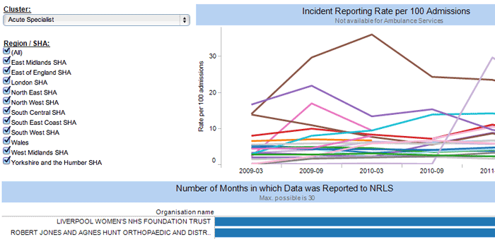
Today I’m releasing the second of my patient safety dashboards, created using data from the NPSA NRLS. You can find notes relating to the data, and the first dashboard which compares clusters, in my original blog post. Dashboard number two lets you compare data for organisations within a single cluster or a single region / SHA, or a combination of the two. All the comments I originally made regarding the data still apply, and I’ll update that post with any more information I find which is relevant.
You can access the dashboard by clicking the preview picture or the link below; if you’ve any questions please feel free to leave a comment below or email me at contact [at] haydnwilliams [dot] com
